Each year, Pantone unveils its Color of the Year, a hue that not only sets design trends but also reflects the social and cultural zeitgeist. For 2022, Pantone introduced a bold and refreshing new color: Very Peri (Pantone 17-3938). This color blends the qualities of blue with a violet-red undertone, symbolizing confidence, creativity, and an evolving spirit.
The Creation of Very Peri: A First for Pantone
What makes the 2022 Color of the Year especially notable is that it marked the first time Pantone created an entirely new shade rather than selecting one from its extensive catalog. Described as a “dynamic periwinkle blue with a vivifying violet-red undertone,” Very Peri was designed to represent the transformative times the world was experiencing at the time.
As we emerged from the challenging period of the COVID-19 pandemic, our societies, cultures, and ways of life were being reshaped. The new color reflected this shift, embracing a forward-looking attitude filled with optimism and imaginative possibilities.
The Meaning Behind Very Peri
Pantone’s choice of Very Peri for 2022 was deeply symbolic. The blend of blue and red tones reflected a merging of the physical and digital worlds, which was becoming increasingly prominent in everyday life. From the rise of the metaverse to virtual realities in gaming, art, and social media, Very Peri embodied the blurring lines between what is real and what is imagined.
Here’s a closer look at the key meanings behind Very Peri:
- Creativity and Innovation: With its bold and energetic undertones, Very Peri encourages individuals to think outside the box and embrace new perspectives. It evokes a sense of curiosity and innovation, urging creatives to explore uncharted territories.
- Optimism and Transformation: As societies adapted to changes brought about by the pandemic, Very Peri stood as a symbol of optimism. Its warm, purple-red undertones conveyed confidence and readiness to embrace transformation, offering a hopeful outlook for the future.
- Blending Physical and Digital Realms: In an era where digital experiences are reshaping how we interact, Very Peri’s color represents this fusion. The use of warm and cool tones suggests balance—between technology and humanity, work and life, creativity and logic.
Very Peri in Design and Fashion
As the 2022 Color of the Year, Very Peri made waves across various industries, particularly in fashion, interior design, and digital media.
- Fashion: Designers embraced Very Peri for its versatility. Whether in high fashion or streetwear, the color became a favorite for its playful yet sophisticated vibe. It added a sense of freshness to clothing and accessories while maintaining a rich, chic appearance.
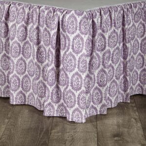
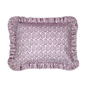
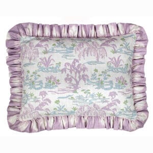
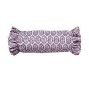
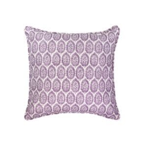
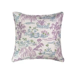
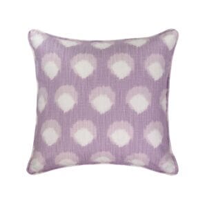
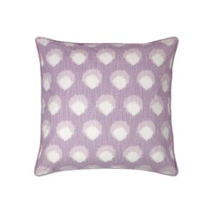
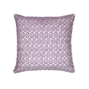
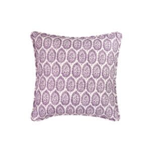
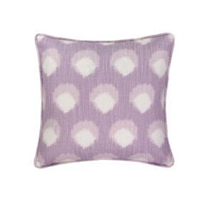
- Interior Design: Very Peri also found its place in home décor. Its calming blue tones and invigorating red accents made it perfect for creating dynamic, yet serene living spaces. From accent walls to furniture and textiles, the color introduced vibrancy into homes, inspiring creativity in everyday environments.
- Digital Design: The hue was a natural fit in digital spaces, from website design to social media branding. Very Peri’s futuristic quality made it the perfect choice for brands wanting to tap into the tech-forward, innovative look.
The Psychological Impact of Very Peri
Colors have a significant impact on mood and perception, and Very Peri was no exception. Its unique blend of tones evoked a variety of psychological responses:
- Blue: Traditionally associated with calmness, trust, and stability, the blue base of Very Peri grounds the color, offering a soothing effect that balances the more energetic red undertones.
- Violet-Red Undertone: The addition of violet-red brings a sense of excitement and passion to the mix. This undertone sparks curiosity, encouraging people to explore new ideas, make bold moves, and embrace change.
Together, these elements made Very Peri an emotionally complex color, ideal for a time of growth, adaptation, and innovation.
A Year of Reflection and Looking Forward
As we reflect on 2022, Very Peri serves as a visual representation of the changes that defined the year. From the resurgence of creativity post-pandemic to the growing influence of digital spaces, this color captured the spirit of the times.
Pantone’s creation of Very Peri wasn’t just about aesthetics—it was about providing the world with a symbol of resilience, hope, and possibility. As we continue to face new challenges and opportunities, Very Peri reminds us to stay imaginative, bold, and ready to transform.
Conclusion
Pantone’s Color of the Year for 2022, Very Peri, represented more than just a trending shade; it was a symbol of creativity, transformation, and optimism in uncertain times. From fashion to digital design, this color reflected a world that was evolving and embracing the future with an open heart and a curious mind. As we move forward, the influence of Very Peri will likely continue to inspire designs, attitudes, and innovations in the years to come.


