Every year, the Pantone Color Institute selects a “Color of the Year” that sets the tone for design, fashion, and cultural trends. For 2021, Pantone made an unprecedented choice by selecting not one but two colors: Ultimate Gray (Pantone 17-5104) and Illuminating (Pantone 13-0647). These two colors, chosen together, symbolized resilience, hope, and unity during a time of global uncertainty and change.
The Meaning Behind the Colors
Ultimate Gray and Illuminating were chosen as complementary colors that reflect the mood and needs of the world in 2021. Here’s a closer look at what each color represents:
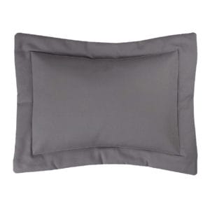
- Ultimate Gray: A neutral, solid gray, Ultimate Gray is described as emblematic of dependability and resilience. It evokes feelings of stability, strength, and calm—qualities that people were seeking after the tumultuous events of 2020. The color is also inspired by nature, symbolizing elements like weathered stones and resilient materials that withstand the test of time.
- Illuminating: In contrast, Illuminating is a bright and cheerful yellow, symbolizing optimism, positivity, and hope. After the challenges brought by the pandemic, social unrest, and political division in 2020, Illuminating provided a much-needed message of brighter days ahead. The color is warm and energizing, like a ray of sunshine, encouraging forward movement with hope and clarity.
Together, these two colors created a balance between strength and positivity, stability and inspiration, perfectly capturing the duality of the time.
Why Two Colors?
2021 was only the second time Pantone selected two colors instead of one for its Color of the Year. The decision to pair a neutral tone with a vibrant, optimistic one was deliberate. Leatrice Eiseman, Executive Director of the Pantone Color Institute, explained that these two colors were chosen to emphasize how different elements come together to support one another. In a world that was still reeling from a global pandemic and massive societal shifts, the combination of a solid foundation (Ultimate Gray) and a hopeful outlook (Illuminating) reflected the collective desire for stability and optimism.
According to Eiseman, “It’s a combination that speaks to resilience, the need to recover and hope for a brighter future.” This dual choice was meant to offer a message of hope that even during the darkest times, light and progress are still possible when we work together and remain resilient.
Impact on Design and Fashion
The Pantone Colors of the Year always influence trends across various industries, from fashion and interior design to branding and technology. Ultimate Gray and Illuminating brought a refreshing palette to these sectors, encouraging designers and brands to explore the balance between neutral and bold, classic and contemporary.
- Fashion: Designers embraced the juxtaposition of the two colors by mixing soft, neutral tones with bursts of bright yellow, creating looks that conveyed both sophistication and vibrancy. Accessories like scarves, shoes, and bags in Illuminating added pops of energy to outfits dominated by neutral tones like Ultimate Gray.
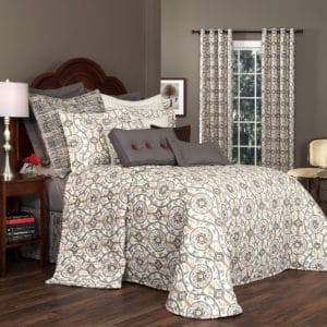
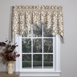
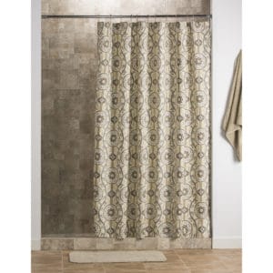
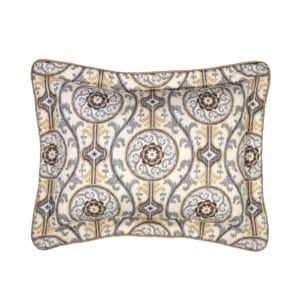
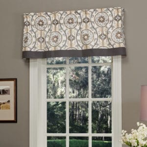
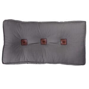
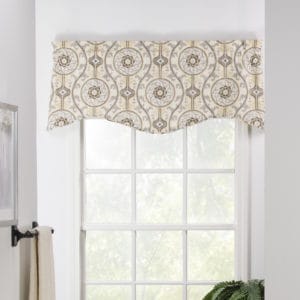
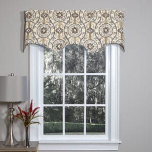
- Home Décor: Interior design saw a rise in the use of Ultimate Gray for its calming, timeless feel, particularly in furniture, walls, and flooring. Meanwhile, Illuminating was used as an accent color—pops of yellow in pillows, throws, or art pieces added a touch of optimism to otherwise neutral spaces.
- Technology and Graphic Design: Many brands began incorporating the two colors into their logos and digital designs. The contrast between the muted gray and vibrant yellow made for striking visuals that felt modern, bold, and balanced.
Pantone’s Role in Global Trends
Pantone’s Color of the Year selection is about more than just aesthetics. The choice often reflects the cultural and social climate, capturing the emotions and energy of the world at a given time. For 2021, Pantone’s selection of Ultimate Gray and Illuminating was a clear reflection of the collective desire for stability after a year of uncertainty, coupled with the hope for brighter days ahead.
The global pandemic, economic challenges, and the call for social justice shaped 2020 in profound ways. As we stepped into 2021, Pantone’s dual-color selection acknowledged the lingering difficulties but also celebrated human resilience and the power of optimism. Ultimate Gray grounded us, while Illuminating inspired us to keep moving forward.
Conclusion
Pantone’s Color of the Year for 2021, Ultimate Gray and Illuminating, represented a powerful message of hope and resilience. These two colors, one neutral and steady, the other bright and uplifting, captured the mood of a world recovering from unprecedented challenges. Together, they inspired a sense of unity, encouraging us to find strength in our foundations while looking forward to a brighter future.
The pairing of these colors across industries—from fashion to home décor—offered both designers and consumers a way to express balance, optimism, and strength. Ultimately, the choice of two colors for 2021 reflected the duality of the times and served as a beacon of hope as the world looked toward recovery.
Read more about how Pantone selects the color of the year here.
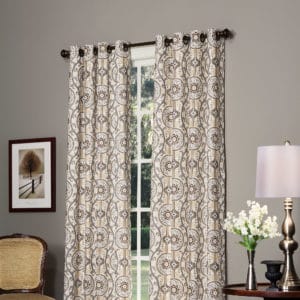
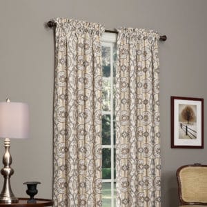
Shop our collection of items that work with the paint colors for 2021.
Izmir Collection


